Python数据可视化-seaborn
1、绘制正负样本对比图seaborn.countplot
import matplotlib.pyplot as plt
import seaborn as sns
# sns.set(style="darkgrid")
titanic = sns.load_dataset("titanic")f,ax=plt.subplots(1,2,figsize=(11,5))
titanic['survived'].value_counts().plot.pie(explode=[0,0.1],autopct='%1.1f%%',ax=ax[0],shadow=True)
ax[0].set_title('survived')
ax[0].set_ylabel('')
sns.countplot('survived',data=titanic,ax=ax[1])
ax[1].set_title('survived')
plt.show()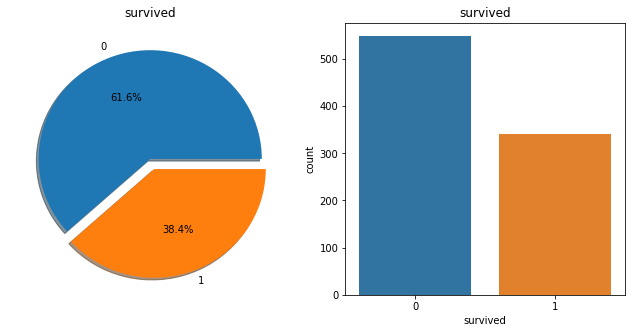
import matplotlib.pyplot as plt
import seaborn as sns
# sns.set(style="darkgrid")
%matplotlib inline
titanic = sns.load_dataset("titanic")

s = titanic['survived'].value_counts().head(10)
ax=s.plot.bar(width=.8)

for i, v in s.reset_index().iterrows():
    ax.text(i, v.survived + 0.2 , v.survived, color='red')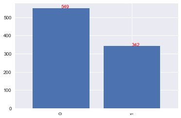
智能推荐

Python Seaborn综合指南,成为数据可视化专家
作者 | SHUBHAM SINGH 编译 | VK 来源 | Analytics Vidhya 概述 Seaborn是Python流行的数据可视化库 Seaborn结合了美学和技术,这是数据科学项目中的两个关键要素 了解其Seaborn作原理以及使用它生成的不同的图表 介绍 一个精心设计的可视化程序有一些特别之...
python科学计算——数据可视化(2) Seaborn
写在前面 在前面的文章介绍了Matplotlib的可视化基本功能,seaborn是基于Matplotlib的基础上进行了封装,能够快速的绘制精美的图表,使用起来比matplotlib更为方便简洁,本文是参考seaborn的官方文档进行的总结。 seaborn的样式控制 先看一下利用Matplotlib的绘制图像: 上面是用Matplotlib默认样式来进行绘图的,要变成seaborn的默认样式,简...
Python数据可视化 | Visualization tricks using Seaborn (2)
Visualization tricks using Seaborn (2) In the process of making visual charts, we often need to deal with the relationship between numeric variables(N) and category variables. Somethings we need to de...
Python数据可视化 | Visualization tricks using Seaborn (1)
Visualization tricks using Seaborn (1) In the process of making visual charts, we often need to deal with the relationship between numeric variables(N) and category variables. Somethings we need to de...

Python小白数据可视化教程: Seaborn 精讲
点击“简说Python”,选择“置顶/星标公众号” 福利干货,第一时间送达! 本文授权转载自王的机器 禁二次转载 作者:王圣元 阅读文本大概需要 24 分钟 老表建议先收藏,慢慢学 或者有需时可以查看 0 引言 本文是 Python 小白教程系列: 今天,我们讲讲数据可视化工具 Seaborn。 Seaborn 是基于 matplotlib...
猜你喜欢
python数据可视化——seaborn库介绍与使用
一、seaborn库介绍 seaborn是基于Matplotlib的Python数据可视化库。它提供了一个高级界面,用于绘制引人入胜且内容丰富的统计图形 只是在Matplotlib上进行了更高级的API封装,从而使作图更加容易 seaborn是针对统计绘图的,能满足数据分析90%的绘图需求,需要复杂的自定义图形还需要使用到Matplotlib seaborn 网站:http://seaborn.p...
Python 数据可视化之 seaborn 使用详解
作者:yhlp https://segmentfault.com/a/1190000017891341 seaborn是python中的一个非常强大的数据可视化库,它集成了matplotlib,下图为seaborn的官网,如果遇到疑惑的地方可以到官网查看。http://seaborn.pydata.org/ 从官网的主页我们就可以看出,seaborn在数据可视化上真的非常强大。 1. 首先我们还是...
Docker-Compose部署nginx 和lnmp
Docker-Compose tomcat lnmp tomcat 使用Docker-Compose部署Nginx代理Tomcat集群,实现负载均衡 在这个目录下创建多个目录 切换到nginx目录修改nginx的主配置文件: [root@host1 compose]# cd nginx/ [root@host1 nginx]# vim default.conf 在末尾添加: 修改: 切换到tmca...

19-20年月度行业分析
Table of Contents 1 对各一级行业分析 2 对女装行业进行分析 对各一级行业分析 platform cid industry category themonth 销售额 访客 客群指数 行业简称 月 年 年月 0 天猫 50010368 ZIPPO/瑞士军刀/眼镜 太阳眼镜 2020-01-01 62484514.13 6663217 ...

Python数据分析入门
博客原文:https://ouduidui.cn/blog/detail?blogId=5fcddf5c61ae700fd80190db 基础知识 数据的分类 数值型数据 表示大小或多少的数据 例子:年龄、年购买量 数值型数据分析方法 最小值和最大值:查看这两个值的目的是为了能够确定一组数据的上界和下界。 **平均值:**平均值可以反映一组数据的综合水平。 **中位数:**中位数和平均数一样都是用...