PYTHON数据可视化(三)seaborn
seaborn库手册翻译(第二章)
数据分布的可视化
当我们处理数据时,第一件事是探索变量的分布。这一章手册将会对seaborn库中检验单变量,双变量分布的函数进行简单介绍。
%matplotlib inline

import numpy as np
import pandas as pd
from scipy import stats, integrate
import matplotlib.pyplot as plt
import seaborn as sns
sns.set(color_codes=True)np.random.seed(sum(map(ord, "distributions")))画出单变量分布
在seaborn中观察单变量分布最简便的方法是调用displot函数,在默认情况下,将会画出一个直方图和一个通过( kernel density estimate(KDE).)核密度估计计算出的概率密度函数。
x = np.random.normal(size=100)
sns.distplot(x);
直方图
直方图实际上非常普遍,marplotlib中也有hist函数。
我们在这移除概率密度函数曲线,然后画出 rug plot,这会在样本点出画出小竖杠。你可以通过rugplot函数画出rug,当然这在一功能在displot():
sns.distplot(x, kde=False, rug=True);
当画直方图时,最重要的选项是格子的数目。在缺失状态下displot()函数运用了一个很简单的准则对这一数字进行了不错的猜想。但是试试更少或者更多可能展现出数据更多的特征。
核密度估计
核密度估计并非广为人知,但是它确实是在绘制分布形状时的有力工具。与在直方图中一样,KDE图中一条轴为样本分布,另一条轴为密度。
sns.distplot(x, hist=False, rug=True);
画出KDE曲线比直方图需要跟多的计算,首先依据以每个观测为均值建立多个正态分布。(具体估计方法。。我去查查书)
x = np.random.normal(0, 1, size=30)
bandwidth = 1.06 * x.std() * x.size ** (-1 / 5.)
support = np.linspace(-4, 4, 200)

kernels = []
for x_i in x:

    kernel = stats.norm(x_i, bandwidth).pdf(support)
    kernels.append(kernel)
    plt.plot(support, kernel, color="r")

sns.rugplot(x, color=".2", linewidth=3);

接下来将其汇总,调整至积分等于1。
density = np.sum(kernels, axis=0)
density /= integrate.trapz(density, support)
plt.plot(support, density);

我们可以看到如果我们调用seaborn库中的kdeplot()函数可以画出相同的图像。这个函数在displot()函数中也被调用,相比之下在你只想要密度函数估计时,它提供了更加细致的选项和接口。
sns.kdeplot(x, shade=True);
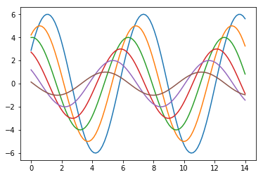
KDE中的bandwith(bw)参数,控制估计拟合数据的紧密程度。类似于直方图中分箱(bin)数量。默认的就不错了,但是你也可以调整,来得到一些别的信息。
sns.kdeplot(x)
sns.kdeplot(x, bw=.2, label="bw: 0.2")
sns.kdeplot(x, bw=2, label="bw: 2")
plt.legend();

从上面的图形中,你可以看到画出的估计曲线超过了观测的最大最小值。我们可以通过cut参数控制这一情况,不过这只会改变图形的样子,并不会改变实际估计出来的曲线。
sns.kdeplot(x, shade=True, cut=0)
sns.rugplot(x);
拟合分布
你也可以用displot()函数,拟合一个分布(也许是你的猜想)(参数由数据集决定),并将其可视化,观察拟合情况。
x = np.random.gamma(6, size=200)
sns.distplot(x, kde=False, fit=stats.gamma);
绘制双变量分布
绘制双变量分布是有时是十分有用的。在seaborn中最简的方法是调用jointplot函数。它会既画出每个变量的分布,也会画出双变量的联合分布。
mean, cov = [0, 1], [(1, .5), (.5, 1)]
data = np.random.multivariate_normal(mean, cov, 200)
df = pd.DataFrame(data, columns=["x", "y"])
散点图
散点图是jointplot函数的默认结果。
sns.jointplot(x="x", y="y", data=df);
像素图
也可以在jointplot中完成,白色背景效果最好。
x, y = np.random.multivariate_normal(mean, cov, 1000).T
with sns.axes_style("white"):
    sns.jointplot(x=x, y=y, kind="hex", color="k");
核密度估计
当然也可以用jointplot画出概率密度分布

你也可以用kdeplot函数画出双变量核密度函数。这可以允许你指定某一变量在你希望的数轴上。
f, ax = plt.subplots(figsize=(6, 6))
sns.kdeplot(df.x, df.y, ax=ax)
sns.rugplot(df.x, color="g", ax=ax)
sns.rugplot(df.y, vertical=True, ax=ax);

如果你想使密度函数更加的连续,你可以提高等高线的数量(increase the number of contour levels)比如下面这种骚操作~。~
f, ax = plt.subplots(figsize=(6, 6))
cmap = sns.cubehelix_palette(as_cmap=True, dark=0, light=1, reverse=True)
sns.kdeplot(df.x, df.y, cmap=cmap, n_levels=60, shade=True);
jointplot()函数使用JointGrid来管理图形。为了令使用达到最大的灵活性,可以直接使用JointGrid来绘制图形。 jointplot()在绘制后返回JointGrid对象,可以使用它添加更多图层或调整可视化的其他方面:
g = sns.jointplot(x="x", y="y", data=df, kind="kde", color="m")
g.plot_joint(plt.scatter, c="w", s=30, linewidth=1, marker="+")
g.ax_joint.collections[0].set_alpha(0)
g.set_axis_labels("$X$", "$Y$")
plt.show()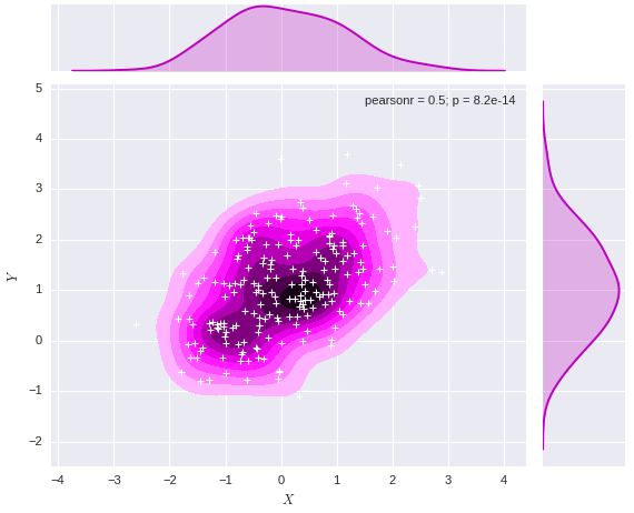
多变量成组可视化
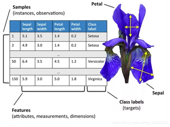
如果你想绘制数据集中多个成对的变量,你可以使用pairplot()函数。它会生成一个含有轴的矩阵,在默认状态下,会将数据集中所有列成对可视化。
iris = sns.load_dataset("iris")
sns.pairplot(iris);
g = sns.PairGrid(iris)
g.map_diag(sns.kdeplot)
g.map_offdiag(sns.kdeplot, cmap="Blues_d", n_levels=6);/Users/mwaskom/anaconda/lib/python2.7/site-packages/matplotlib/axes/_axes.py:545: UserWarning: No labelled objects found. Use label='...' kwarg on individual plots.
warnings.warn("No labelled objects found. "
智能推荐
Python数据可视化-matplotlib and seaborn
鸢尾花iris.csv文件 numpy, matplotlib, seaborn, pandas 1 画线,set_style( ) set( ) 2 distplot( )直方图加强版,kdeplot( )密度曲线图 3 箱线图 boxplot( ) 4 热图 heatmap( ) 5 散点图 scatter( ) 6 矩阵散点图 pairplot( ) 7 柱状图 bar() 8 饼图 pie...

Python Seaborn综合指南,成为数据可视化专家
作者 | SHUBHAM SINGH 编译 | VK 来源 | Analytics Vidhya 概述 Seaborn是Python流行的数据可视化库 Seaborn结合了美学和技术,这是数据科学项目中的两个关键要素 了解其Seaborn作原理以及使用它生成的不同的图表 介绍 一个精心设计的可视化程序有一些特别之...
python科学计算——数据可视化(2) Seaborn
写在前面 在前面的文章介绍了Matplotlib的可视化基本功能,seaborn是基于Matplotlib的基础上进行了封装,能够快速的绘制精美的图表,使用起来比matplotlib更为方便简洁,本文是参考seaborn的官方文档进行的总结。 seaborn的样式控制 先看一下利用Matplotlib的绘制图像: 上面是用Matplotlib默认样式来进行绘图的,要变成seaborn的默认样式,简...
Python数据可视化 | Visualization tricks using Seaborn (2)
Visualization tricks using Seaborn (2) In the process of making visual charts, we often need to deal with the relationship between numeric variables(N) and category variables. Somethings we need to de...
Python数据可视化 | Visualization tricks using Seaborn (1)
Visualization tricks using Seaborn (1) In the process of making visual charts, we often need to deal with the relationship between numeric variables(N) and category variables. Somethings we need to de...
猜你喜欢

Python小白数据可视化教程: Seaborn 精讲
点击“简说Python”,选择“置顶/星标公众号” 福利干货,第一时间送达! 本文授权转载自王的机器 禁二次转载 作者:王圣元 阅读文本大概需要 24 分钟 老表建议先收藏,慢慢学 或者有需时可以查看 0 引言 本文是 Python 小白教程系列: 今天,我们讲讲数据可视化工具 Seaborn。 Seaborn 是基于 matplotlib...
python数据可视化——seaborn库介绍与使用
一、seaborn库介绍 seaborn是基于Matplotlib的Python数据可视化库。它提供了一个高级界面,用于绘制引人入胜且内容丰富的统计图形 只是在Matplotlib上进行了更高级的API封装,从而使作图更加容易 seaborn是针对统计绘图的,能满足数据分析90%的绘图需求,需要复杂的自定义图形还需要使用到Matplotlib seaborn 网站:http://seaborn.p...
Docker-Compose部署nginx 和lnmp
Docker-Compose tomcat lnmp tomcat 使用Docker-Compose部署Nginx代理Tomcat集群,实现负载均衡 在这个目录下创建多个目录 切换到nginx目录修改nginx的主配置文件: [root@host1 compose]# cd nginx/ [root@host1 nginx]# vim default.conf 在末尾添加: 修改: 切换到tmca...

19-20年月度行业分析
Table of Contents 1 对各一级行业分析 2 对女装行业进行分析 对各一级行业分析 platform cid industry category themonth 销售额 访客 客群指数 行业简称 月 年 年月 0 天猫 50010368 ZIPPO/瑞士军刀/眼镜 太阳眼镜 2020-01-01 62484514.13 6663217 ...

Python数据分析入门
博客原文:https://ouduidui.cn/blog/detail?blogId=5fcddf5c61ae700fd80190db 基础知识 数据的分类 数值型数据 表示大小或多少的数据 例子:年龄、年购买量 数值型数据分析方法 最小值和最大值:查看这两个值的目的是为了能够确定一组数据的上界和下界。 **平均值:**平均值可以反映一组数据的综合水平。 **中位数:**中位数和平均数一样都是用...