Seaborn.set()与Seaborn.catplot()
标签: python
一、导入相关包
%config IPCompleter.greedy=True
import seaborn as sns
import pandas as pd
import numpy as np
import matplotlib as mpl
import matplotlib.pyplot as plt
%matplotlib inline
二、Seaborn绘图风格设置
1.sns.set()设置风格
seaborn.set()函数参数:seaborn.set(context=‘notebook’, style=‘darkgrid’, palette=‘deep’, font=‘sans-serif’, font_scale=1, color_codes=True, rc=None)
从这个set()函数,可以看出,通过它我们可以设置背景色、风格、字型、字体等。我们定义一个函数,这个函数主要是生成100个0到15的变量,然后用这个变量画出6条曲线。
def sinplot(flip=2):
    x = np.linspace(0, 15, 100)
    for i in range(1, 6):
        plt.plot(x, np.sin(x + i * .5) * (7 - i) * flip)
sns.set()
sinplot()
那么,问题来了,有人会说,这个set()函数这么多参数,只要改变其中任意一个参数的值,绘图效果就会发生变化,那我们怎么知道哪种搭配是最佳效果呢,难道我们要一个个去测试吗?当然不是,seaborn提供了5种默认的风格,我们在实际绘图中只要选择一种喜欢的风格就可以了,下面我们就看看这5种风格的用法及效果。
seaborn.set()使用5种默认风格
函数参数:seaborn.set_style(style=None, rc=None),这里style可选参数值有:darkgrid,whitegrid,dark,white,ticks,下面我们就通过设置不同的风格,看看每种风格的效果。
1)'white’
sns.set(style='white')
sinplot()
2)'whitegrid’
sns.set(style='whitegrid')
sinplot()
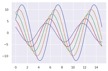
3)'darkgrid’
sns.set(style='darkgrid')
sinplot()
![[外链图片转存失败,源站可能有防盗链机制,建议将图片保存下来直接上传(img-r0aCsZ5w-1579483126427)(output_9_0.png)]](https://img-blog.csdnimg.cn/20200120092110365.png)
4)'dark’
sns.set(style='dark')
sinplot()
![[外链图片转存失败,源站可能有防盗链机制,建议将图片保存下来直接上传(img-bCT50iIt-1579483126428)(output_11_0.png)]](https://img-blog.csdnimg.cn/20200120092118918.png)
5)'ticks’
sns.set(style='ticks')
sinplot()
![[外链图片转存失败,源站可能有防盗链机制,建议将图片保存下来直接上传(img-nmYJohv6-1579483126429)(output_13_0.png)]](https://img-blog.csdnimg.cn/20200120092128622.png)
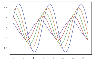
2.seaborn.despine()
这个函数可以移除图像的上部和右侧的坐标轴,我们看看效果。
sinplot()
sns.despine()
![[外链图片转存失败,源站可能有防盗链机制,建议将图片保存下来直接上传(img-82uT7ibT-1579483126430)(output_15_0.png)]](https://img-blog.csdnimg.cn/20200120092130107.png)
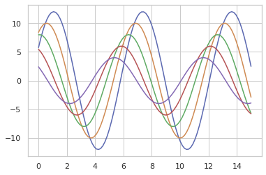
这里默认移除了上部和右侧的轴,当然我们也可以移除其他轴,只要将表示四个边的参数值改为true即可,下面是个这个函数的参数seaborn.despine(fig=None, ax=None, top=True, right=True, left=False, bottom=False, offset=None, trim=False),其中offset表示偏离左侧轴的距离。
sinplot()
sns.despine(offset=50)
![[外链图片转存失败,源站可能有防盗链机制,建议将图片保存下来直接上传(img-d3N3guV3-1579483126432)(output_17_0.png)]](https://img-blog.csdnimg.cn/20200120092146407.png)
3. 使用with打开某种风格
在matplotlib中我们已经学过了,在一个figure对象中,我们可以添加多个子图,那么如果不同的子图使用不同的风格,我们该如何做呢?很简单,使用with 打开某种风格,然后在with下画的图都使用with打开的分格,我们来看看代码。
fig = plt.figure()
with sns.axes_style("darkgrid"):
    ax1 = fig.add_subplot(211)
    sinplot(4)
fig.add_subplot(212)
sinplot(-4)
![[外链图片转存失败,源站可能有防盗链机制,建议将图片保存下来直接上传(img-i6OjEwJD-1579483126433)(output_19_0.png)]](https://img-blog.csdnimg.cn/20200120092152279.png)
4. seaborn.set_context()
seaborn.set_context(context=None, font_scale=1, rc=None)这个函数也是来设置绘图背景参数的,它主要来影响标签、线条和其他元素的效果,但不会影响整体的风格,跟style有点区别。这个函数默认使用notebook,其他context可选值有:paper, talk, poster。下面我们看看具体的效果。
sns.set_context("paper")
plt.figure(figsize=(6, 4))
sinplot()
![[外链图片转存失败,源站可能有防盗链机制,建议将图片保存下来直接上传(img-cBo6iQI9-1579483126434)(output_21_0.png)]](https://img-blog.csdnimg.cn/20200120092204273.png)
sns.set_context("talk")
plt.figure(figsize=(6, 4))
sinplot()
![[外链图片转存失败,源站可能有防盗链机制,建议将图片保存下来直接上传(img-6mVYdmKu-1579483126435)(output_22_0.png)]](https://img-blog.csdnimg.cn/20200120092212180.png)
sns.set_context("poster")
plt.figure(figsize=(6, 4))
sinplot()
![[外链图片转存失败,源站可能有防盗链机制,建议将图片保存下来直接上传(img-CZNRaMcy-1579483126436)(output_23_0.png)]](https://img-blog.csdnimg.cn/20200120092218898.png)
sns.set_context("notebook", font_scale=1.5, rc={"lines.linewidth": 2.5})
plt.figure(figsize=(6, 4))
sinplot()
![[外链图片转存失败,源站可能有防盗链机制,建议将图片保存下来直接上传(img-QDgUohUS-1579483126437)(output_24_0.png)]](https://img-blog.csdnimg.cn/20200120092217582.png)
5. 修改字体
sns.set(style="ticks", font='cmr10')
plt.xlabel('font cmr10')
plt.ylabel('this is a special font')
Text(0, 0.5, 'this is a special font')
![[外链图片转存失败,源站可能有防盗链机制,建议将图片保存下来直接上传(img-RP1XcxMC-1579483126438)(output_26_1.png)]](https://img-blog.csdnimg.cn/20200120092233708.png)
sns.set(style="ticks", font='cmmi10')
plt.xlabel('font cmr10')
plt.ylabel('this is a special font')
Text(0, 0.5, 'this is a special font')
![[外链图片转存失败,源站可能有防盗链机制,建议将图片保存下来直接上传(img-DU01jhtX-1579483126438)(output_27_1.png)]](https://img-blog.csdnimg.cn/2020012009224396.png)
三、Seaborn.catplot()分类型数据绘图
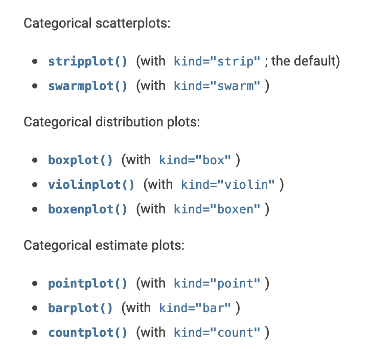
下面所有函数的最高级别的整合接口:catplot()
Categorical scatterplots:
- stripplot() (with kind=“strip”; the default)
- swarmplot() (with kind=“swarm”)
Categorical distribution plots:
- boxplot() (with kind=“box”)
- violinplot() (with kind=“violin”)
- boxenplot() (with kind=“boxen”)
Categorical estimate plots:
- pointplot() (with kind=“point”)
- barplot() (with kind=“bar”)
- countplot() (with kind=“count”)
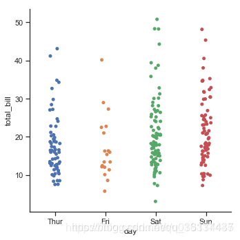
1. 分类散点图
分类坐标轴:catplot(kind=“strip”)默认
tips= sns.load_dataset("tips")
print(tips.head())
print(tips.dtypes)
   total_bill   tip     sex smoker  day    time  size
0       16.99  1.01  Female     No  Sun  Dinner     2
1       10.34  1.66    Male     No  Sun  Dinner     3
2       21.01  3.50    Male     No  Sun  Dinner     3
3       23.68  3.31    Male     No  Sun  Dinner     2
4       24.59  3.61  Female     No  Sun  Dinner     4
total_bill     float64
tip            float64
sex           category
smoker        category
day           category
time          category
size             int64
dtype: object
当在同一个类别中出现大量取值相同或接近的观测数据时,他们会挤到一起。seaborn中有两种分类散点图,分别以不同的方式处理了这个问题。 catplot()使用的默认方式是stripplot(),它给这些散点增加了一些随机的偏移量,更容易观察:
sns.catplot(x="day", y="total_bill", data=tips)
<seaborn.axisgrid.FacetGrid at 0x7fd84c9aff28>
![[外链图片转存失败,源站可能有防盗链机制,建议将图片保存下来直接上传(img-K053aGVE-1579483126439)(output_31_1.png)]](https://img-blog.csdnimg.cn/20200120092303301.png)
jitter参数控制着偏移量的大小,或者我们可以直接禁止他们偏移:
sns.catplot(x="day", y="tip", jitter=False,data=tips)
<seaborn.axisgrid.FacetGrid at 0x7fd84c8355c0>
![[外链图片转存失败,源站可能有防盗链机制,建议将图片保存下来直接上传(img-dqwq0GOa-1579483126440)(output_33_1.png)]](https://img-blog.csdnimg.cn/20200120092312200.png)
蜂群图:catplot(kind=“swarm”)
相当于swarmplot() 避免了散点之间的重合,提供更好的方式来呈现观测点的分布。 但仅适用于较小的数据集。
sns.catplot(kind="swarm", x="day", y="tip", data=tips)
<seaborn.axisgrid.FacetGrid at 0x7fd84c7f6160>
![[外链图片转存失败,源站可能有防盗链机制,建议将图片保存下来直接上传(img-DCN4sczd-1579483126441)(output_35_1.png)]](https://img-blog.csdnimg.cn/20200120092313197.png)
- hue参数:利用不同颜色区分
与关系图类似,也可以通过hue来增加一个维度。BUT分类图不支持size和style
sns.catplot(kind="swarm", x="day", y="tip", hue="sex", data=tips)
<seaborn.axisgrid.FacetGrid at 0x7fd84c816208>
![[外链图片转存失败,源站可能有防盗链机制,建议将图片保存下来直接上传(img-fsYtqxqG-1579483126441)(output_37_1.png)]](https://img-blog.csdnimg.cn/20200120092326645.png)
- col参数, 指定某一切面来考察数据
sns.catplot(kind="swarm", x="day", y="tip", hue="sex", col="smoker", data=tips)
<seaborn.axisgrid.FacetGrid at 0x7fd84cee2cc0>
![[外链图片转存失败,源站可能有防盗链机制,建议将图片保存下来直接上传(img-ZJcMFM43-1579483126442)(output_39_1.png)]](https://img-blog.csdnimg.cn/20200120092339201.png)
- 考察切面时, 利用height, aspect参数
sns.catplot(x="day", y="tip", hue="sex", col="smoker", height=5, aspect=.8, data=tips)
<seaborn.axisgrid.FacetGrid at 0x7fd847b49fd0>
![[外链图片转存失败,源站可能有防盗链机制,建议将图片保存下来直接上传(img-iIj5SBWc-1579483126443)(output_41_1.png)]](https://img-blog.csdnimg.cn/20200120092339476.png)
- 切面时, 使用参数 col_wrap, 让每行显示指定数量的图,如果超过该数量,则多行显示。
sns.catplot(x="day", y="tip", hue="sex", col="size", height=5, aspect=.8, col_wrap=2, data=tips)
<seaborn.axisgrid.FacetGrid at 0x7fd847cb1630>
![[外链图片转存失败,源站可能有防盗链机制,建议将图片保存下来直接上传(img-03VBCgTZ-1579483126444)(output_43_1.png)]](https://img-blog.csdnimg.cn/20200120092350242.png)
- 关于x(分类型数据)轴的分类值的顺序,函数会自己推断。 如果数据是pandas的Categorical类型,那么默认的分类顺序可以在pandas中设置; 如果数据看起来是数值型的(比如1,2,3…),那他们也会被排序。 即使我们使用数字作为不同分类的标签,它们仍然是被当做分类型数据按顺序绘制在分类变量对应的坐标轴上的:
注意,2和4之间的距离与1和2之间的距离是一样的,它们是不同的分类,只会排序,但是并不会改变它们在坐标轴上的距离
sns.catplot(x="size", y="tip", kind="swarm", data=tips.query("size!=3"))
<seaborn.axisgrid.FacetGrid at 0x7fd84c735710>
![[外链图片转存失败,源站可能有防盗链机制,建议将图片保存下来直接上传(img-CliH8zqz-1579483126445)(output_45_1.png)]](https://img-blog.csdnimg.cn/2020012009240179.png)
- order参数:指定分类值顺序
sns.catplot(kind="swarm",x="size", y="tip", order=[6,5,4,3,2,1],data=tips.query("size!=3"))
<seaborn.axisgrid.FacetGrid at 0x7fd84c757278>
![[外链图片转存失败,源站可能有防盗链机制,建议将图片保存下来直接上传(img-ImHJ6pXG-1579483126445)(output_47_1.png)]](https://img-blog.csdnimg.cn/20200120092406229.png)
sns.catplot(kind="swarm", x="smoker",y="tip", order=["No","Yes"], data=tips)
<seaborn.axisgrid.FacetGrid at 0x7fd84c91efd0>
![[外链图片转存失败,源站可能有防盗链机制,建议将图片保存下来直接上传(img-T0AgGcyu-1579483126446)(output_48_1.png)]](https://img-blog.csdnimg.cn/20200120092411884.png)
- 有些时候把分类变量放在垂直坐标轴上会更有帮助(尤其是当分类名称较长或者分类较多时)
只需要交换x和y分配的变量即可:
sns.catplot(x="total_bill", y="day", hue="time", kind="swarm", data=tips);
![[外链图片转存失败,源站可能有防盗链机制,建议将图片保存下来直接上传(img-AGuyU7oN-1579483126447)(output_50_0.png)]](https://img-blog.csdnimg.cn/20200120092417525.png)
2、分类分布图
当数据量越来越大时,散点图在表现不同分类的观测值的分布信息就越来越捉襟见肘了。 此时,有其他的方式:
- 箱线图:catplot(kind=“box”)
- 小提琴图:catplot(kind=“violin”)
箱线图:catplot(kind=“box”)
展现了:离群点、上界、上四分位数、均值、中位数、下四分位数、下界、离群点
sns.catplot(kind="box", x="day", y="total_bill", data=tips)
<seaborn.axisgrid.FacetGrid at 0x7fd84c842240>
![[外链图片转存失败,源站可能有防盗链机制,建议将图片保存下来直接上传(img-EZkrCoUB-1579483126447)(output_52_1.png)]](https://img-blog.csdnimg.cn/20200120092417853.png)
增加一个维度的信息:
sns.catplot(kind="box", x="day", y="total_bill", hue="smoker", data=tips)#增加一个维度的信息
<seaborn.axisgrid.FacetGrid at 0x7fd889643b38>
![[外链图片转存失败,源站可能有防盗链机制,建议将图片保存下来直接上传(img-c79VXF5n-1579483126448)(output_54_1.png)]](https://img-blog.csdnimg.cn/20200120092430644.png)
上面的图中,默认了hue参数对应的变量smoker与坐标轴上的分类变量day是相互嵌套的(如,周四吸烟、周四不吸烟),这种操作叫**“dodging”**。 如果不是这种情形,应该禁用dodging,看下面的例子: hue的Weekend和day不是相互嵌套的:
× 错误的图:
tips["Weekend"]= tips["day"].isin(["Sat","Sun"])  # isin 返回布尔值
sns.catplot(kind="box", x="day", y="total_bill", hue="Weekend", data=tips)
<seaborn.axisgrid.FacetGrid at 0x7fd84cb5ef98>
![[外链图片转存失败,源站可能有防盗链机制,建议将图片保存下来直接上传(img-ZfTPy38m-1579483126449)(output_56_1.png)]](https://img-blog.csdnimg.cn/20200120092435876.png)
√ 正确的图(禁用dodge,dodge=False):
sns.catplot(kind="box", x="day", y="total_bill", hue="Weekend",dodge=False, data=tips)
<seaborn.axisgrid.FacetGrid at 0x7fd84f3754e0>
![[外链图片转存失败,源站可能有防盗链机制,建议将图片保存下来直接上传(img-lkCNpOrr-1579483126449)(output_58_1.png)]](https://img-blog.csdnimg.cn/20200120092442488.png)
box的进阶:catplot(kind=“boxen”)
与箱线图相似但是能展示更多关于数据分布形状的信息,它对大数据更加友好:
sns.catplot(kind="boxen", x="day", y="total_bill", data=tips)
<seaborn.axisgrid.FacetGrid at 0x7fd84ceff358>
![[外链图片转存失败,源站可能有防盗链机制,建议将图片保存下来直接上传(img-rj62y38y-1579483126450)(output_60_1.png)]](https://img-blog.csdnimg.cn/20200120092439556.png)
小提琴图:catplot(kind=“violin”)
- 它将箱线图和核密度估计(kde: kernel density estimation)结合起来
sns.catplot(kind="violin", y="day", x="total_bill",hue="time", data=tips)
<seaborn.axisgrid.FacetGrid at 0x7fd84cc2bda0>
![[外链图片转存失败,源站可能有防盗链机制,建议将图片保存下来直接上传(img-PiGsEK4m-1579483126451)(output_62_1.png)]](https://img-blog.csdnimg.cn/20200120092454276.png)
- 参数split=Ture
当一个额外的分类变量仅有2个水平时,我们也可以将它赋给hue参数,并且设置split=True,这样我们可以更加充分地利用空间来表达更多信息:
sns.catplot(kind="violin", y="day", x="total_bill",hue="time",split=True, data=tips)
<seaborn.axisgrid.FacetGrid at 0x7fd84c6a5048>
![[外链图片转存失败,源站可能有防盗链机制,建议将图片保存下来直接上传(img-4GHUs0wd-1579483126451)(output_64_1.png)]](https://img-blog.csdnimg.cn/20200120092502599.png)
3. 分类统计估计图
在某些应用场景中,相对于展示每类的分布情况,更像展示每类的数据的集中趋势估计(统计量,如均值、中位数、方差等)。 有以下方式:
- 条形图:catplot(kind=“bar”)
- 直方图:catplot(kind=“count”)
- 点图:catplot(kind=“point”)
条形图:catplot(kind=“bar”)
在seaborn中,barplot()函数在整个数据集上运行,并且应用一个函数来获得那些统计量(默认为均值)。当每个分类中有多个观测值时,它还可以通过自助采样法计算出一个置信区间,并且通过误差棒的方式绘制出来。
titanic = sns.load_dataset("titanic")
print(len(titanic))
titanic.head()
891
| survived | pclass | sex | age | sibsp | parch | fare | embarked | class | who | adult_male | deck | embark_town | alive | alone | |
|---|---|---|---|---|---|---|---|---|---|---|---|---|---|---|---|
| 0 | 0 | 3 | male | 22.0 | 1 | 0 | 7.2500 | S | Third | man | True | NaN | Southampton | no | False |
| 1 | 1 | 1 | female | 38.0 | 1 | 0 | 71.2833 | C | First | woman | False | C | Cherbourg | yes | False |
| 2 | 1 | 3 | female | 26.0 | 0 | 0 | 7.9250 | S | Third | woman | False | NaN | Southampton | yes | True |
| 3 | 1 | 1 | female | 35.0 | 1 | 0 | 53.1000 | S | First | woman | False | C | Southampton | yes | False |
| 4 | 0 | 3 | male | 35.0 | 0 | 0 | 8.0500 | S | Third | man | True | NaN | Southampton | no | True |
sns.catplot(kind="bar", x="sex", y="survived", hue="class", data=titanic)
<seaborn.axisgrid.FacetGrid at 0x7fd84c4d7d30>
![[外链图片转存失败,源站可能有防盗链机制,建议将图片保存下来直接上传(img-UwtGW2Eh-1579483126452)(output_68_1.png)]](https://img-blog.csdnimg.cn/20200120092515411.png)
可以清晰明了地看出来: 女性幸存者高于男性; 舱级高的幸存者高于舱级低的。
catplot(kind=“count”):展示每个分类下观测值的数量
“属于分类变量而非连续变量的直方图”
想要展示每个分类下观测值(样本)的数量而非统计量。这就像是“属于分类变量而非连续变量的直方图”。
仅给一个轴(要水平方向画就x:你的分类变量;垂直方向就y:你的分类变量),另一个轴默认为count了:
如,展示买各个class票的人数:
sns.catplot(kind="count", x="class",data=titanic)
<seaborn.axisgrid.FacetGrid at 0x7fd84cbf1cc0>
![[外链图片转存失败,源站可能有防盗链机制,建议将图片保存下来直接上传(img-6KVu0en2-1579483126453)(output_70_1.png)]](https://img-blog.csdnimg.cn/20200120092520860.png)
sns.catplot(kind="count", x="class", hue="alive",data=titanic)
<seaborn.axisgrid.FacetGrid at 0x7fd847eb19e8>
![[外链图片转存失败,源站可能有防盗链机制,建议将图片保存下来直接上传(img-fPukNozJ-1579483126454)(output_71_1.png)]](https://img-blog.csdnimg.cn/20200120092526631.png)
#也可以将连续型变量当成分类型变量
sns.catplot(kind="count", y="size",data=tips,color='c')
<seaborn.axisgrid.FacetGrid at 0x7fd8474472b0>
![[外链图片转存失败,源站可能有防盗链机制,建议将图片保存下来直接上传(img-OTNX3b1F-1579483126461)(output_72_1.png)]](https://img-blog.csdnimg.cn/20200120092528767.png)
catplot(kind=“point”):
sns.catplot(kind="point", x="sex", y ="fare", data=titanic)
<seaborn.axisgrid.FacetGrid at 0x7fd84c6a5470>
![[外链图片转存失败,源站可能有防盗链机制,建议将图片保存下来直接上传(img-GRxfyXLo-1579483126462)(output_74_1.png)]](https://img-blog.csdnimg.cn/20200120092536833.png)
智能推荐
数据可视化库之Seaborn教程(catplot)
catplot(): 用分类型数据(categorical data)绘图 在关系图教程中,我们了解了如何使用不同的可视化表示来显示数据集中多个变量之间的关系。在这些例子中,我们关注的主要关系是两个数值变量之间的情况。如果其中一个主要变量是“分类”(分为不同的组),那么使用更专业的可视化方法可能会有所帮助。 下面所有函数的最高级别的整合接口:catplot() Catego...
可视化库seaborn:swarmplot、tsplot、PairGrid 、violinplot、barplot、boxplot、palplot、`Facetgrid、catplot、heatmap
1 布局&风格设置:set_style() sns.set()使用seaborn默认的参数/风格组合;seaborn 的5种主题风格如下: 常用的绘图方法 sns.set_style("dark") 背景为深色,没有刻度线 sns.set_style("ticks") # 加刻度线 sns.despine() # 指定其它参数,去掉上方和右边的线段 ...
Seaborn | 初识Seaborn
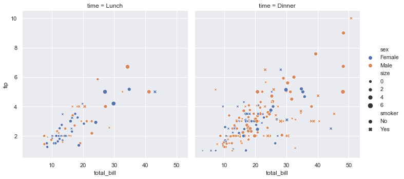
tips小费数据集 total_bill: 总金额 tip: 小费金额 sex: 性别 smoker: 是否抽烟 day: 周几 time: 午饭(Lunch), 晚餐(Dinner) size: 用餐人数 total_bill tip sex smoker day time size 0 16.99 1.01 Female No Sun Dinner 2 1 10.34 1.66 Male No...

详细的数据可视化库之Seaborn教程(二)——catplot:分类型数据作坐标轴画图
文章目录 catplot(): 用分类型数据(categorical data)绘图 一、分类散点图 “分类坐标轴” 1.catplot(kind="strip")默认 2、蜂群图:catplot(kind="swarm") hue参数:利用不同颜色区分 order参数:指定分类值顺序 有些时候把分类变量放在垂直坐标轴上会更有帮助(尤...
用 Seaborn 做数据可视化(1)——绘图功能(2)可视化分类数据:sns.catplot()
目录 0. 概述 1. 分类散点图 1.1 catplot() 默认 kind='strip' 1.2 catplot(kind='swarm') 2. 类中观测值分布 2.1 catplot(kind='box') 2.2 catplot(kind="boxen") 2.3 catplot(kind="violin") 3. 类中统计评估 3.1 catp...
猜你喜欢
seaborn绘图
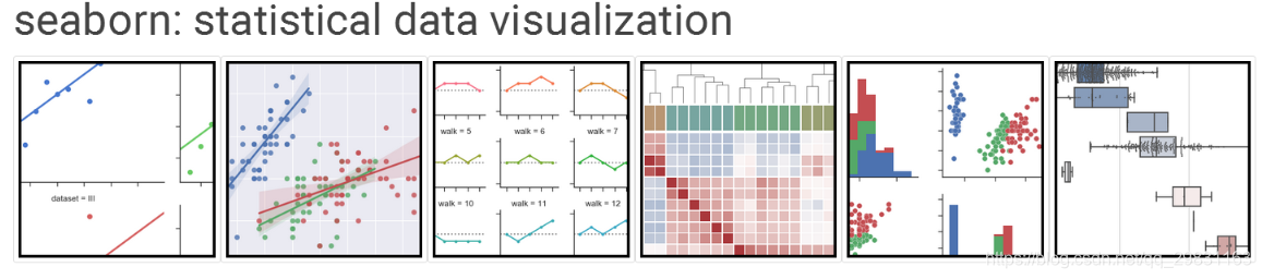
Python中的一个制图工具库,可以制作出吸引人的、信息量大的统计图 在Matplotlib上构建,支持numpy和pandas的数据结构可视化,甚至是scipy和statsmodels的统计模型可视化 seaborn的特点: 多个内置主题及颜色主题 可视化单一变量、二维变量用于比较数据集中各变量的分布情况 可视化线性回归模型中的独立变量及不独立变量 可视化矩阵数据,通过聚类算法探究矩阵间的结构 ...

Seaborn学习
1 什么是Seaborn Seaborn是基于matplotlib的图形可视化python包。它提供了一种高度交互式界面,便于用户能够做出各种有吸引力的统计图表。 Seaborn是在matplotlib的基础上进行了更高级的API封装,从而使得作图更加容易,在大多数情况下使用seaborn能做出很具有吸引力的图,而使用matplotlib就能制作具有更多特色的图。应该把Seaborn视为matpl...
Docker-Compose部署nginx 和lnmp
Docker-Compose tomcat lnmp tomcat 使用Docker-Compose部署Nginx代理Tomcat集群,实现负载均衡 在这个目录下创建多个目录 切换到nginx目录修改nginx的主配置文件: [root@host1 compose]# cd nginx/ [root@host1 nginx]# vim default.conf 在末尾添加: 修改: 切换到tmca...

19-20年月度行业分析
Table of Contents 1 对各一级行业分析 2 对女装行业进行分析 对各一级行业分析 platform cid industry category themonth 销售额 访客 客群指数 行业简称 月 年 年月 0 天猫 50010368 ZIPPO/瑞士军刀/眼镜 太阳眼镜 2020-01-01 62484514.13 6663217 ...

Python数据分析入门
博客原文:https://ouduidui.cn/blog/detail?blogId=5fcddf5c61ae700fd80190db 基础知识 数据的分类 数值型数据 表示大小或多少的数据 例子:年龄、年购买量 数值型数据分析方法 最小值和最大值:查看这两个值的目的是为了能够确定一组数据的上界和下界。 **平均值:**平均值可以反映一组数据的综合水平。 **中位数:**中位数和平均数一样都是用...